
For this project, we worked closely with the clients in order to ascertain the style they wanted for their flat. They already had a lot of very interesting furniture and decorative elements, but the flat itself was lacking presence. They felt like they were living in a display home to sell a property development project…
Before : a blank page
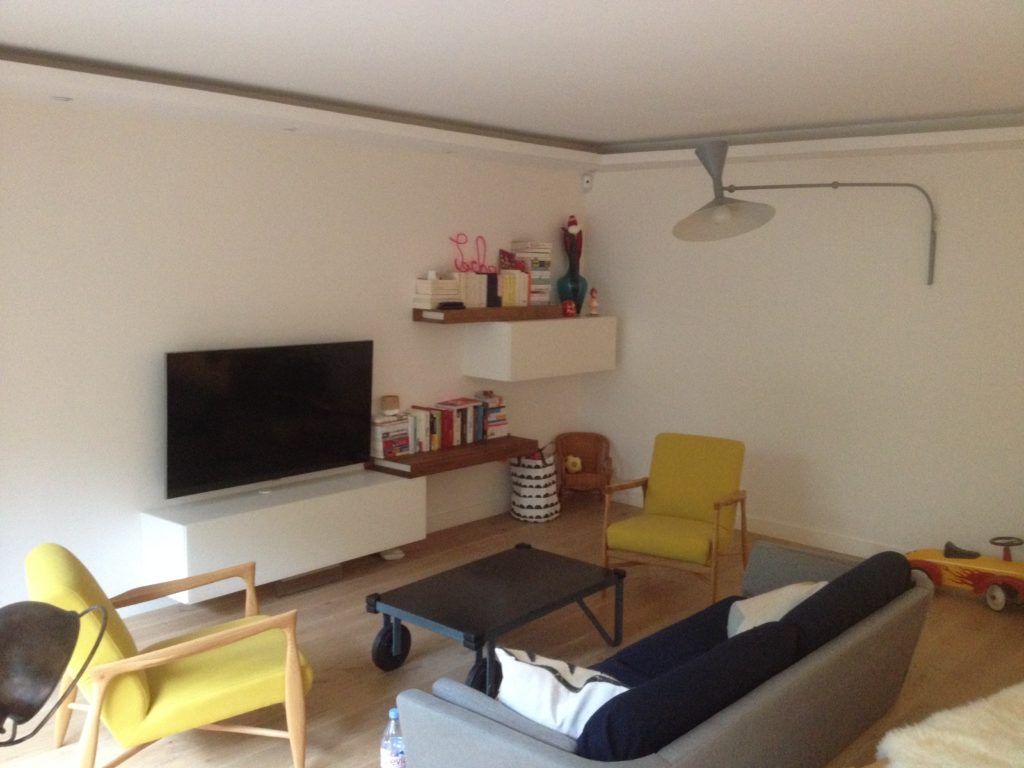
Works had already been done in this apartment and white was the color chosen in order to keep as much light as possible. This is a common thing to do, especially in Paris. This flat was on the ground floor (with garden), so the natural light was an issue and white was suppose to maximise it’s brightness. The desired effect was reached, but after a while, they felt like the were living in a sterile environment like a hospital and all their designer furniture was just lost in the space created.
No structural work was needed, but we needed to find a way to “break” this endless hallway connecting to another corridor. In the bedroom, the dressing needed to be closed off and united to the whole room. In the lounge, the linear of the walls needed to be broken and all was too horizontal. This linear feel was aggravated by the TV cabinet and shelving units at the end wall.
After : bold choices pay off
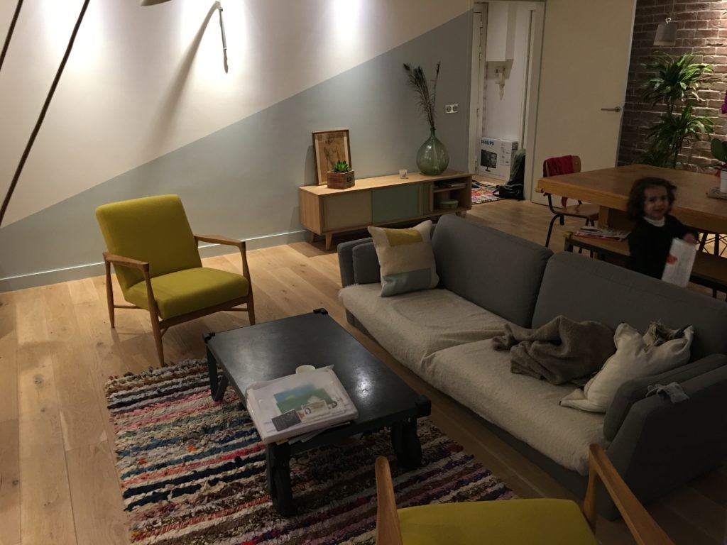
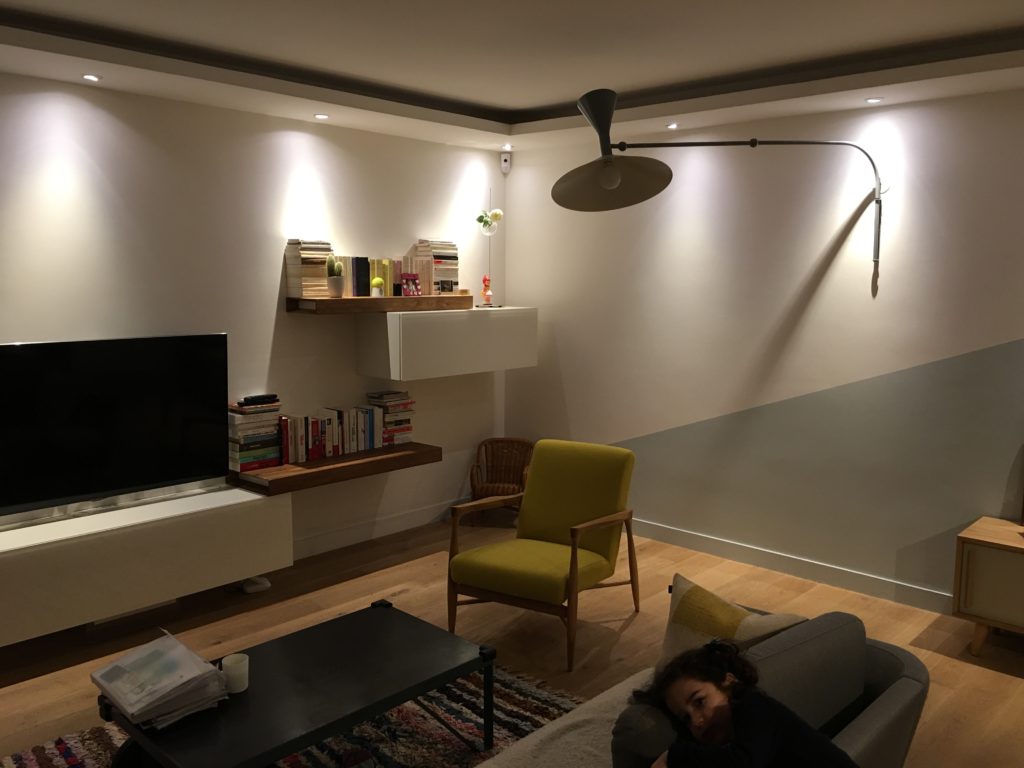
In the lounge, we chose a diagonal. It links the two main walls at its tip on the corner, follows to include the door and finishes on the ceiling of the kitchen. Clients were a bit hesitant at first, but some photoshop editing of their current lounge helped them visualise what the effect would be. We chose a light blue with a hint of grey to go with the existing mustard and grey furniture. Some more furniture was purchased and colours for the doors of the cabinet were especially chosen to finish up the universe. Other decorative elements were added on a vertical not to break furthermore the horizontality of the room.
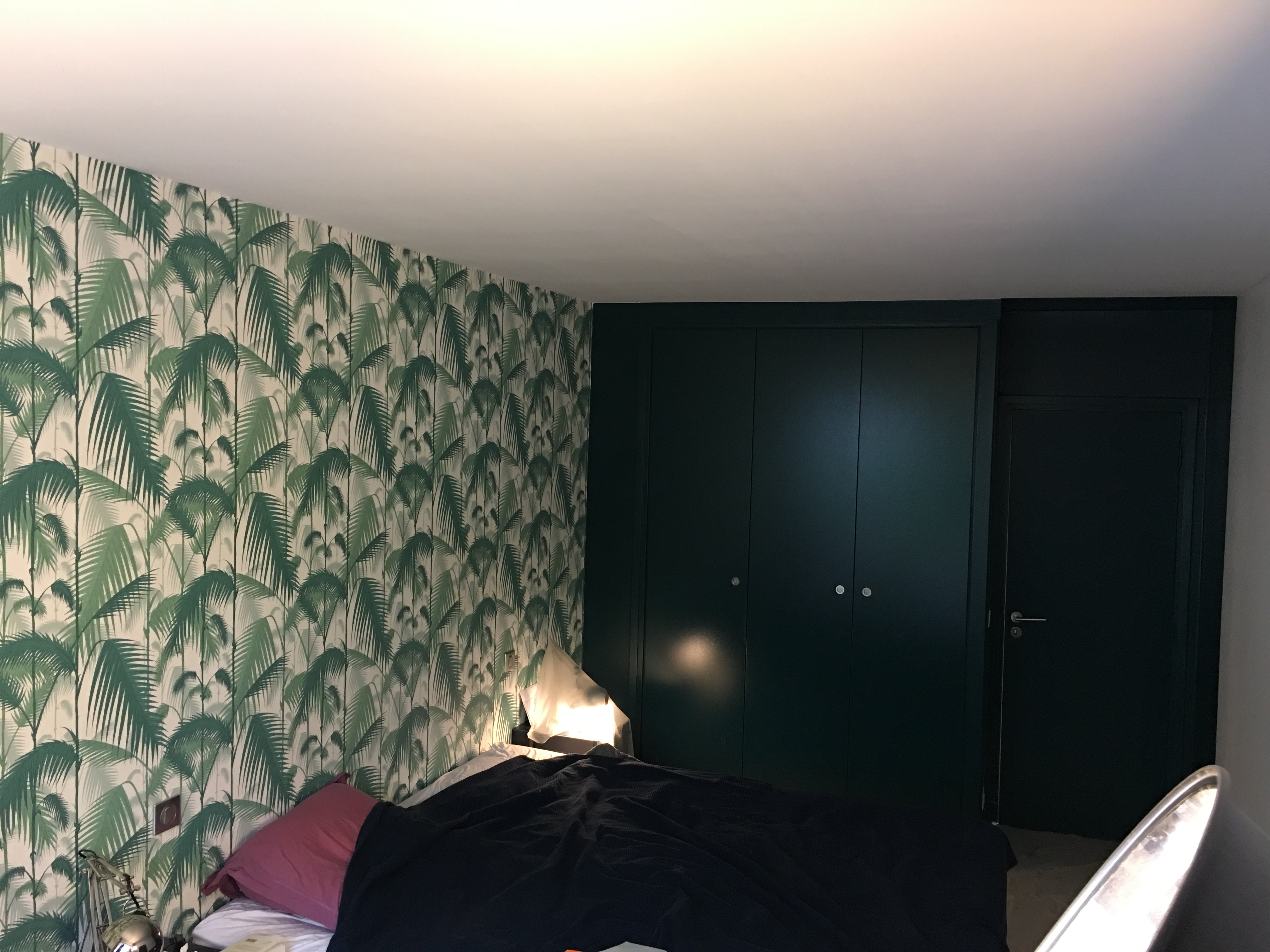
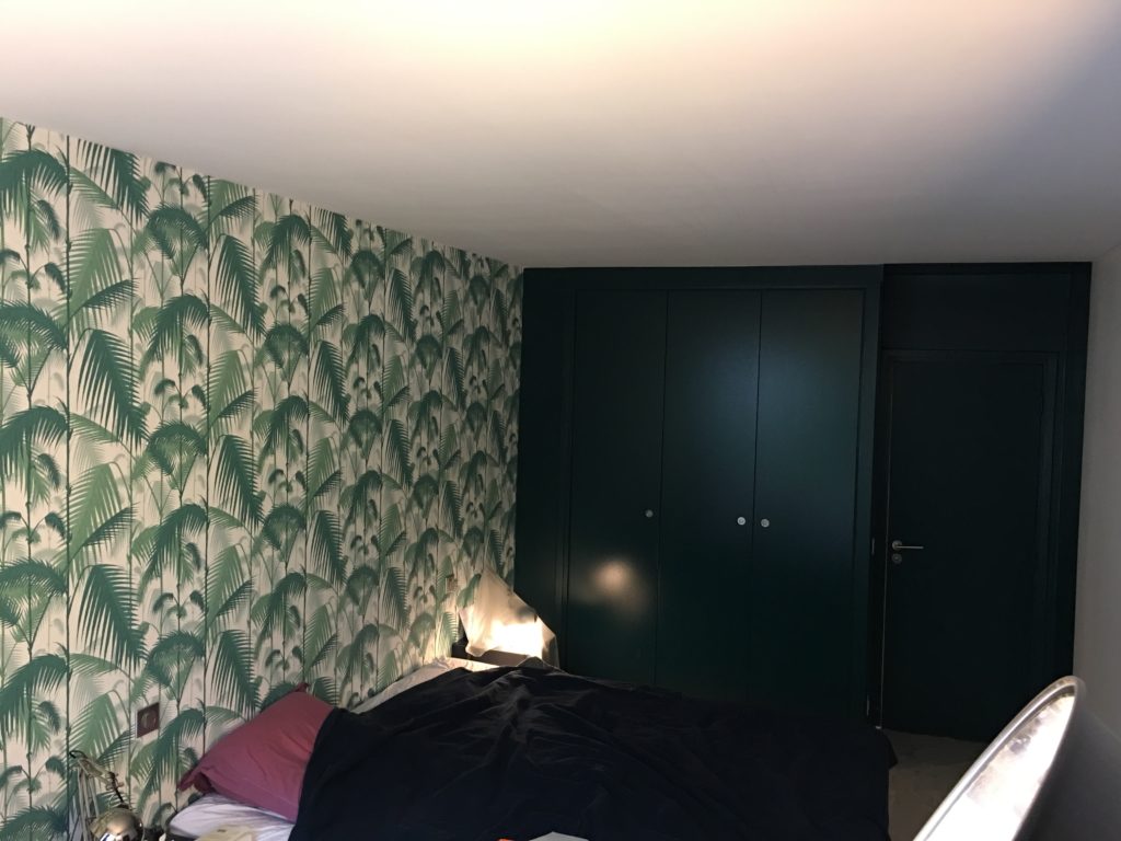
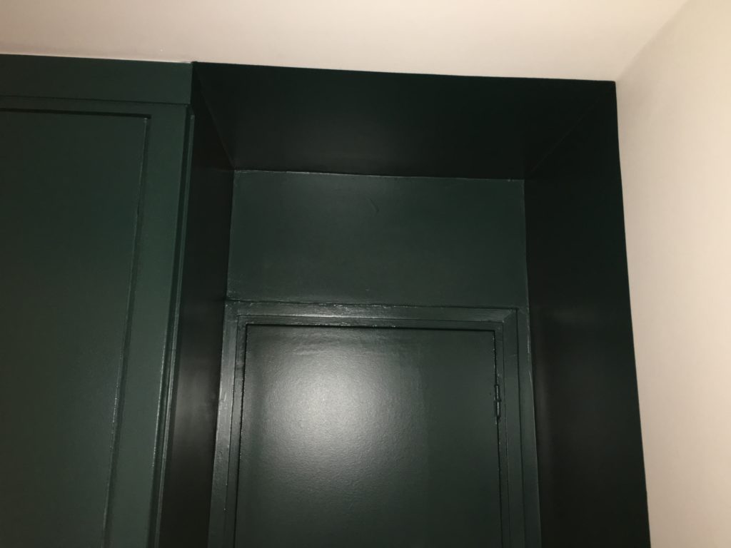
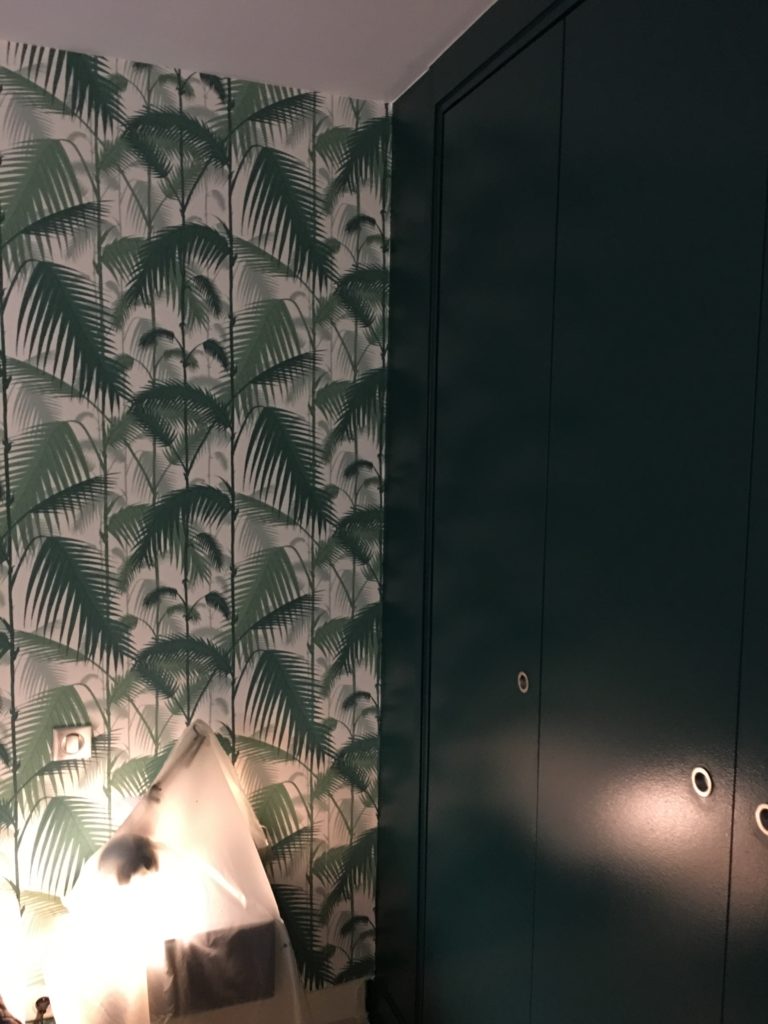
At first the dark green chosen for the bedroom was a bit of a fright for the clients, but they decided to follow the vision I had for the whole project. Doors of the dressing were painted and I decided to add the entrance to the bedroom as well in order to create an alcove and a little vestibule feel. It also helps make the room look more rectangular by visually erasing the dressing and creating a straight finish of the room. The starting element being the wallpaper that was already purchased, wall hang dressing tables were added and the bedding chosen to match the whole universe. New lights and lamp post were also chosen to finish it all off. After a couple nights to adjust, they now love the cocooning effect that this dark green adds to the bedroom.
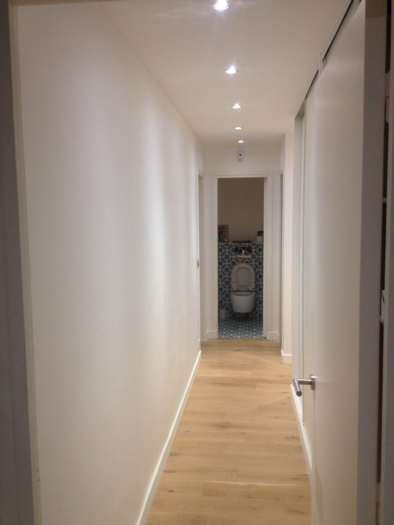
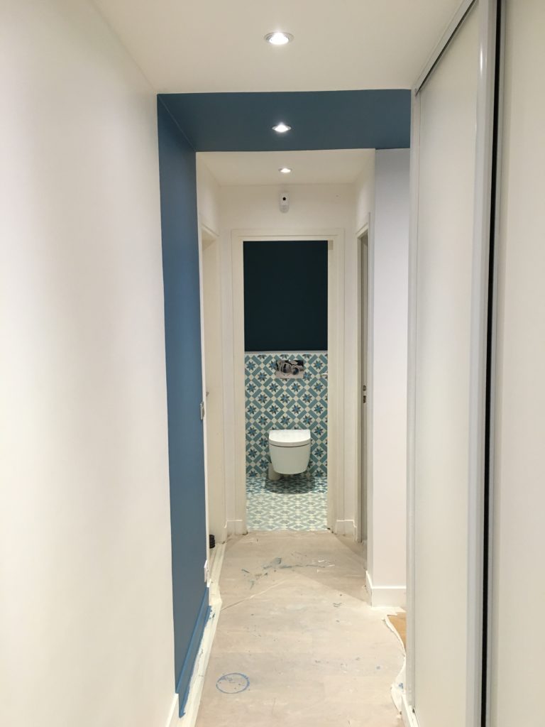
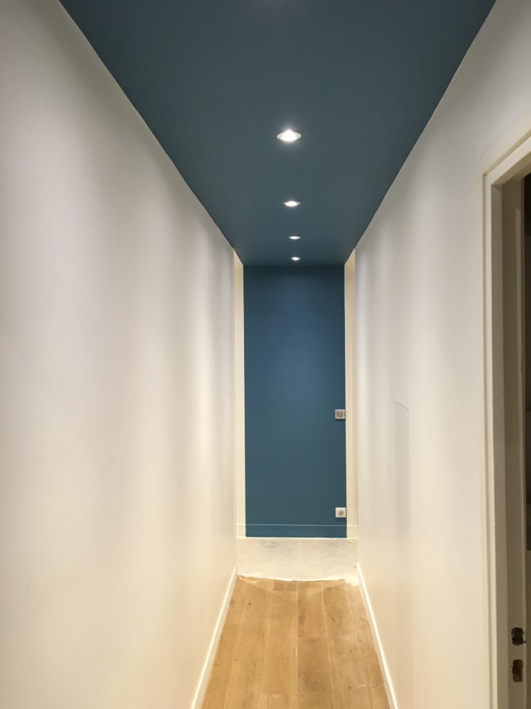
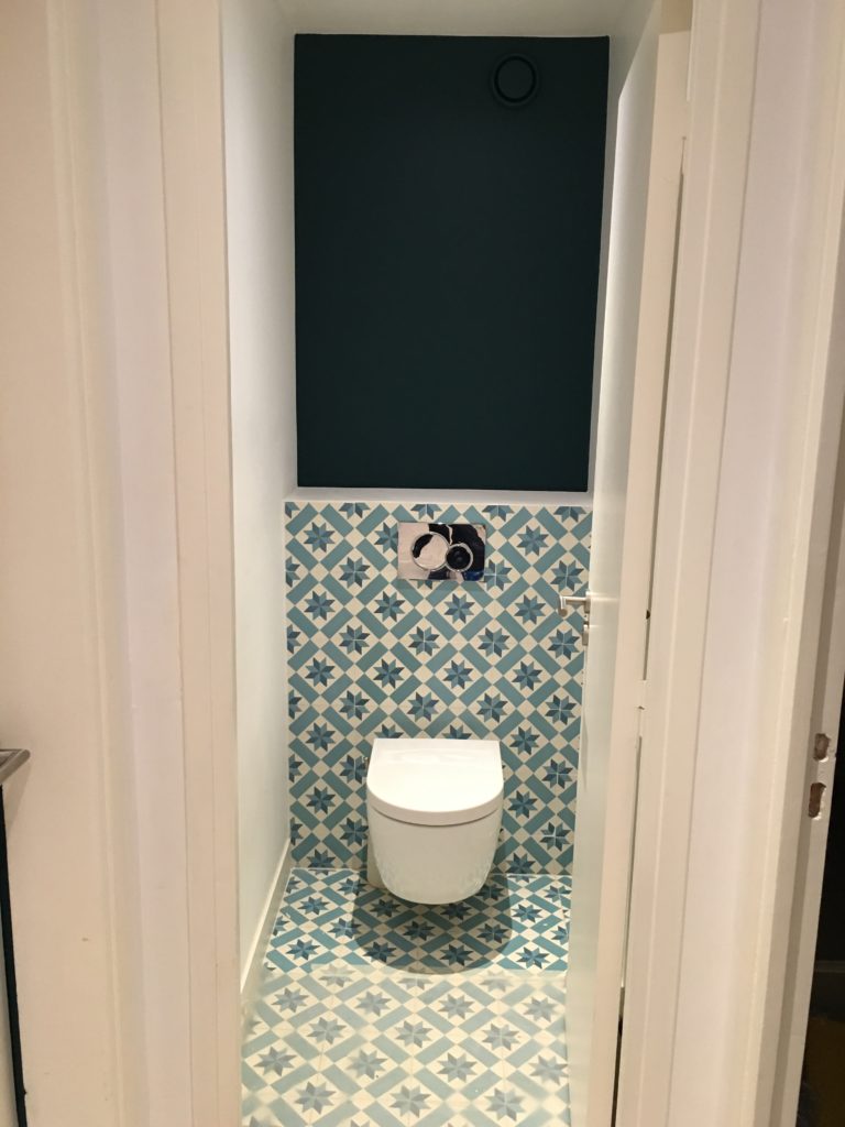
In the hallway, I decided to connect the corridor to the hallway by the ceiling. At the end of the corridor, the paint made a structural beam disappear and the prolongation of it on the hallway wall helps break the length of it. You will find it also frames the toilets when the door is open. The toilets tiles were actually the starting point to chose the color and it results in a striking effect. Once again, clients were a bit hesitant at first. “It’s only paint, we can always change it if we don’t like it”. They now love the way it interconnects the two spaces together and would not change it at all.
Upon completion of the project, we managed to create a coherent ensemble incorporating all existing furniture and creating a really contemporary and modern look with a clever use of some bold colour choices.